

Giving got easier. Receiving still doesn't.
Five weeks after launching Fika for Substack, here's what I shipped, what I turned down, and the some problems I still haven't touched.

Hi, I'm Stefania 👋 Welcome to Stef's Dev Notes, where I write about engineering judgment in an industry obsessed with speed: the trade-offs behind the architecture, and the reasoning that decides whether systems scale or quietly break.
Five weeks ago I launched Fika for Substack — a weekly appreciation table where you take a slice by leaving a kind word for a writer, a reader, a friend, or just “the table.” No accounts, no leaderboards, no algorithm. Just a cake that fills up with kind words and a wall that keeps them.
My goal was to see what happens after launching this little experiment — whether people actually come back, whether the app tells me anything true about how appreciation moves through this community.
If you missed the first article about Fika for Substack and the motivation behind it, you can check it here.

Here’s what I built in response to the first five weeks of that.
The share flow got real
At launch, sharing a slice barely existed. Since then I shipped two things:
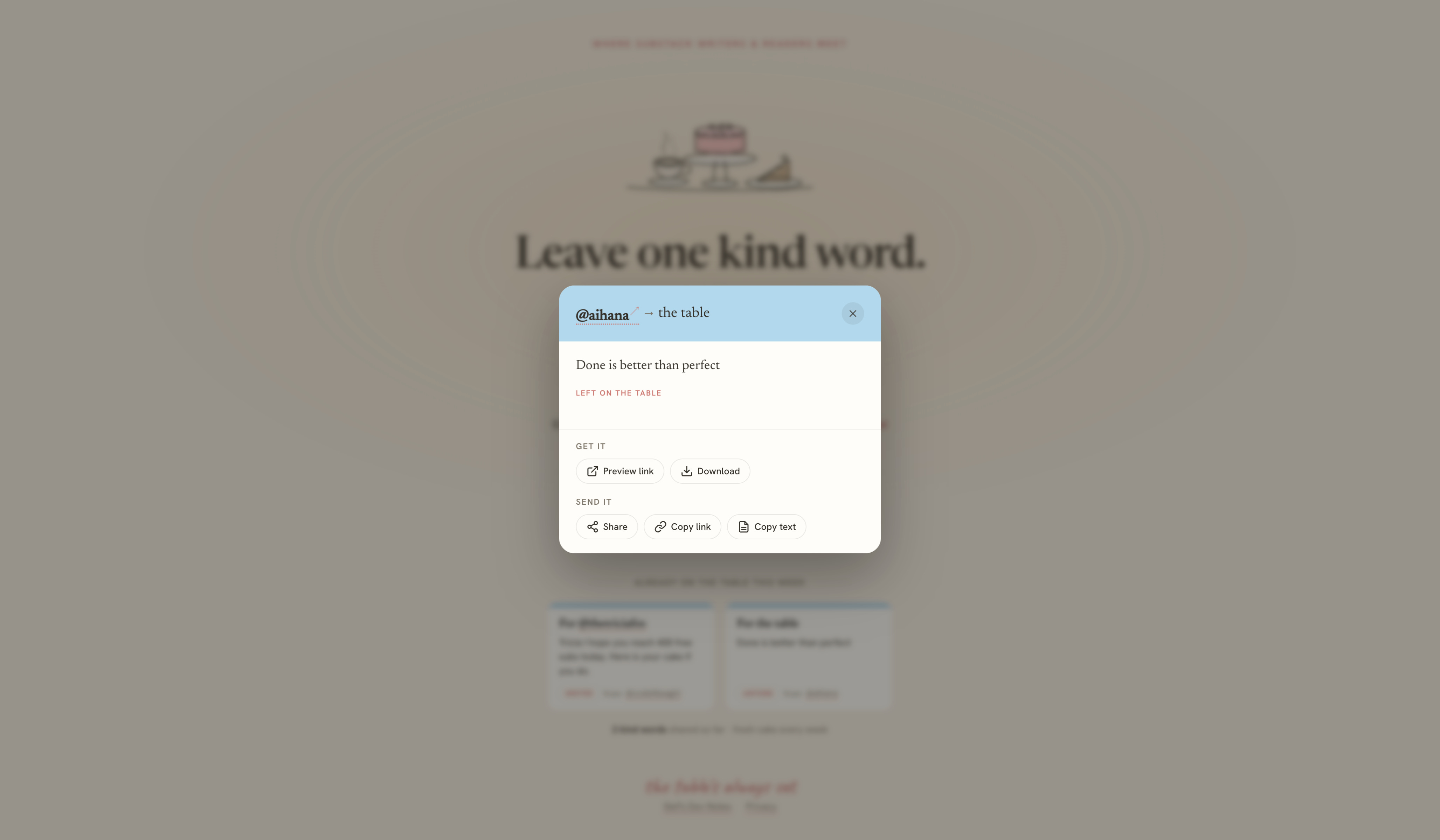
A preview link that opens your slice’s share page in a new tab, so you can see what you’re about to send without losing your place on the cake
A downloadable share card — the same slice, rendered as a PNG you can post anywhere. It’s rendered entirely client-side: the card component gets rasterized off-screen at 2x scale and turned into a PNG in the browser, no server round-trip, no image pipeline to run or pay for
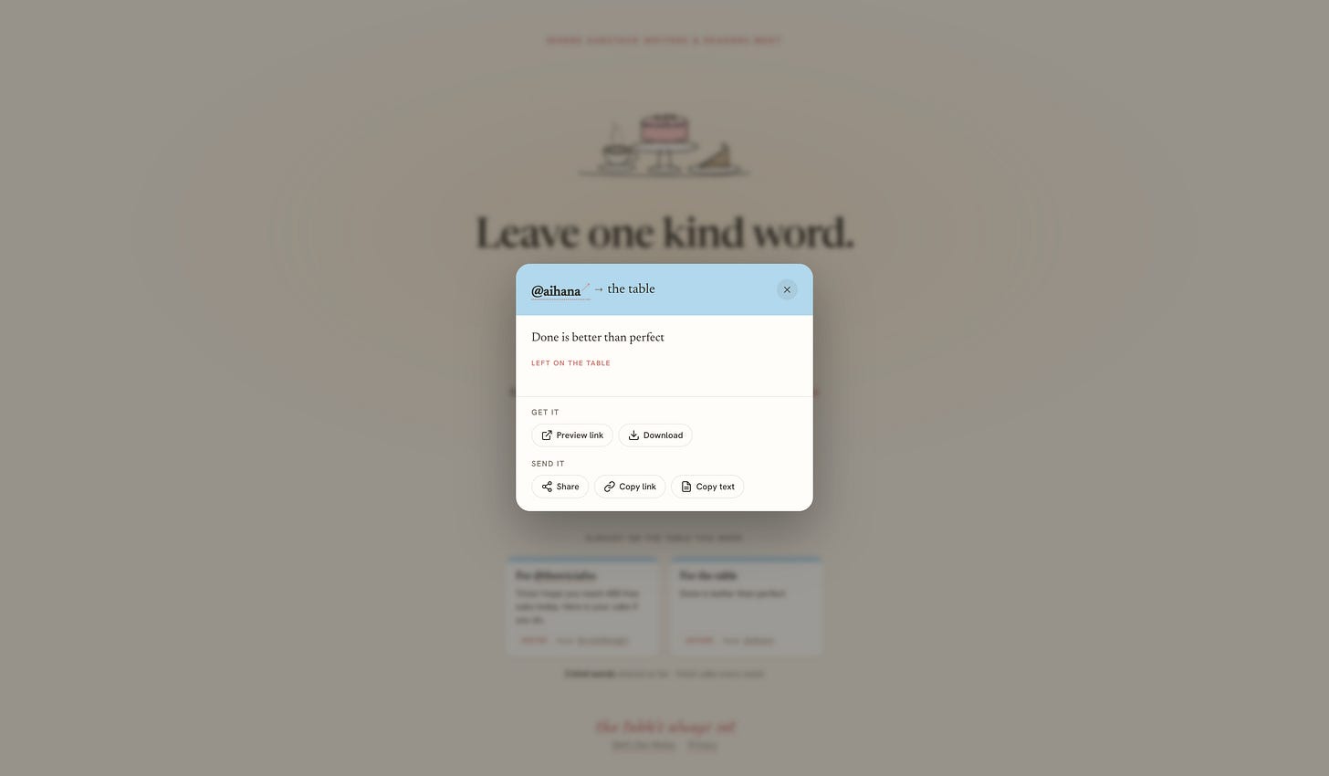
The two things that didn't exist at launch: a preview link and a downloadable card.
And a fix to something that had bothered me since launch day:
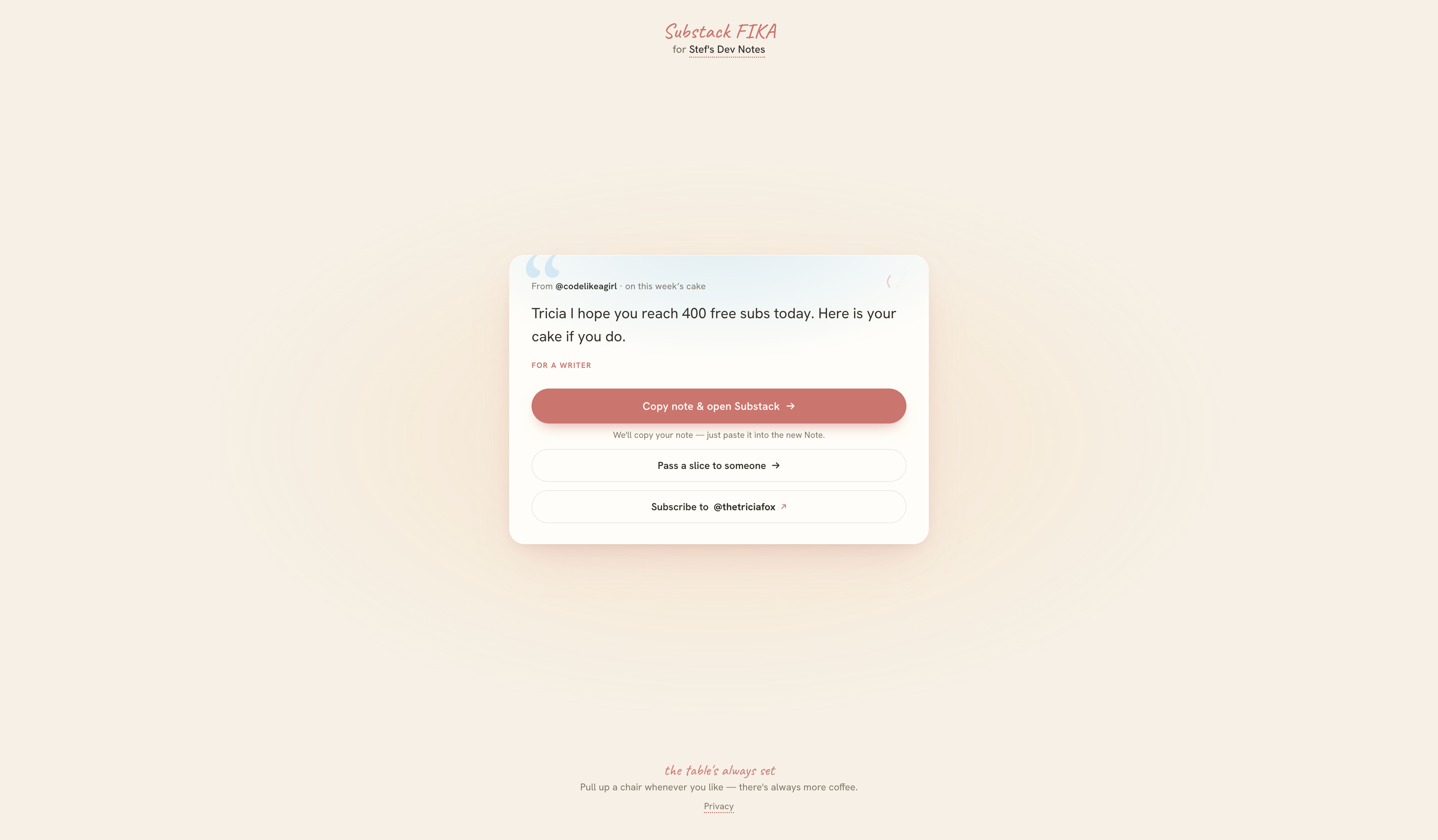
the share page had two buttons fighting to be the main action — subscribe to the writer, or pass the slice along. I’d sketched two options for which one should win, “subscribe primary” or “pass-a-slice primary.” Neither felt right once I looked at the actual page. I shipped a third path instead: “Copy note & open Substack” is now the one solid button; the other two sit underneath it, secondary.
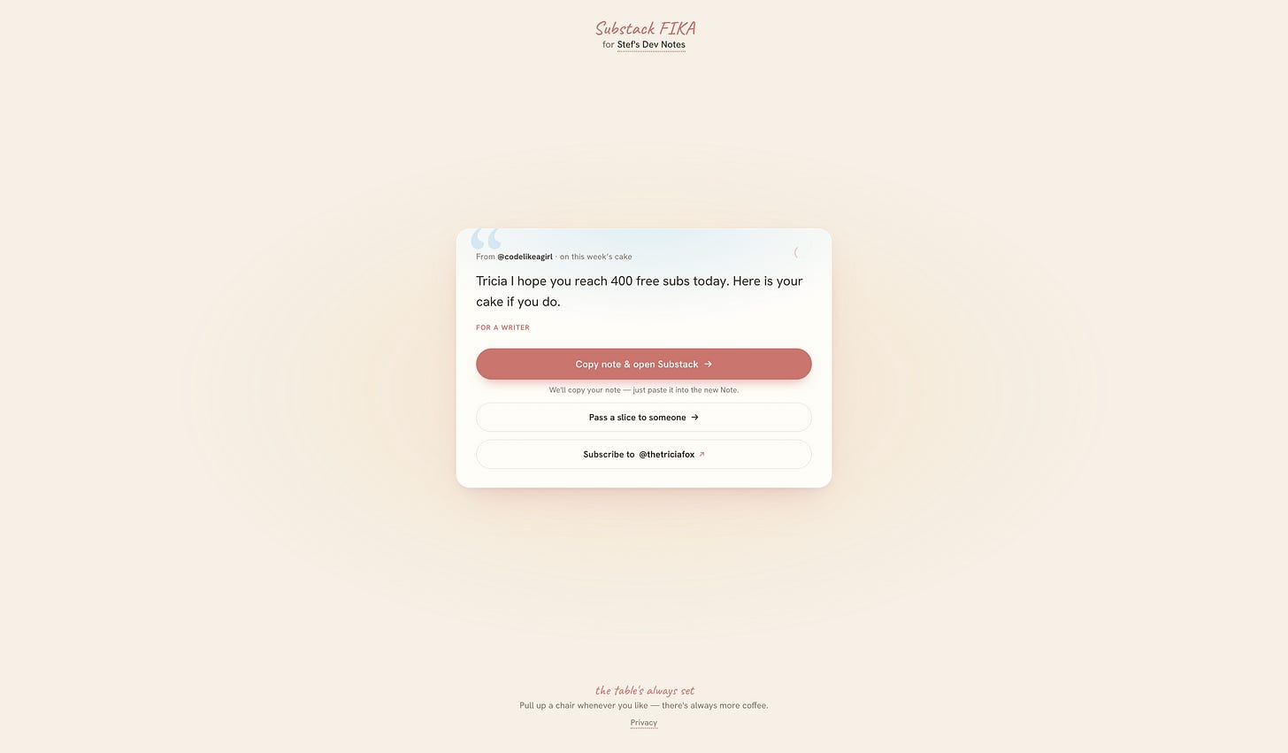
The share page now: Copy note & open Substack is the one solid button; the other two are secondary. 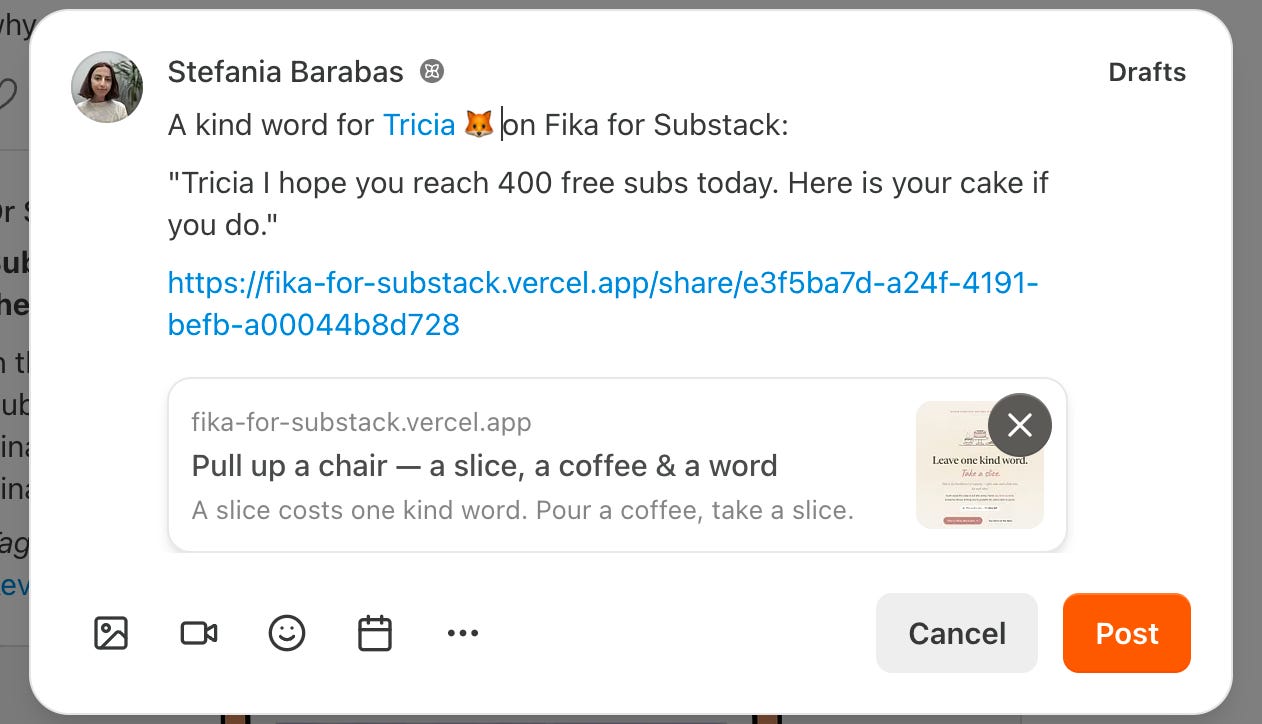
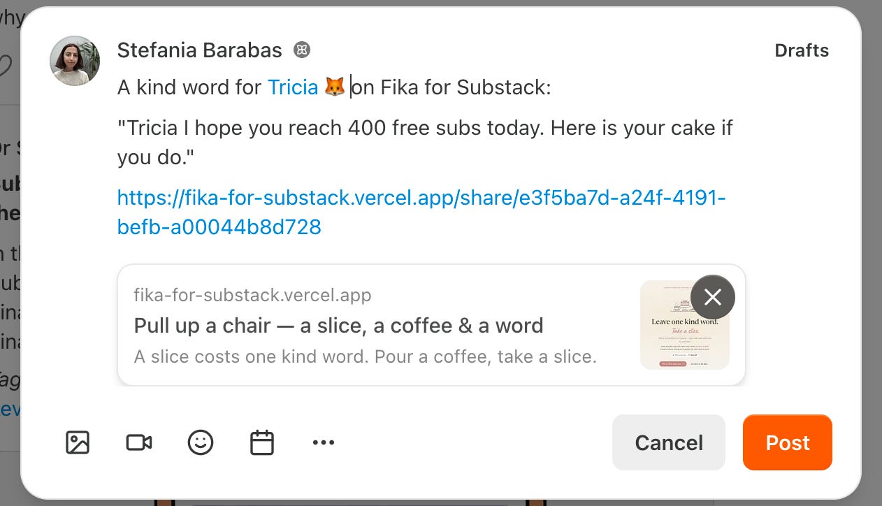
Pasting appreciation note from Fika for Substack to a Substack Note
I don't have enough conversion data on that page yet. I can't tell you the new button gets more people to actually subscribe or pass a slice along, through Substack.
What I do have is traffic: the share pages have had about 40 views since launch, and a chunk of it is other Substack writers' domains showing up as referrers. That's a sign at least some of those clicks are coming from slices actually being passed along, not just sitting unopened.
The give modal got a real fix too. Looking up a Substack profile happens through a small serverless function — it fetches the public profile page server-side (so the browser never has to deal with CORS) and pulls the name, avatar, and bio out of its structured data.
At launch it only took an exact @handle without having a matched profile. Now it can search by name, using Substack’s own site-search endpoint — which ranks by relevance, not by exact match, and can hand back more than one person with the same name. So instead of guessing which one you meant, it returns up to five candidates and lets you pick — with a default avatar for anyone whose Substack profile doesn’t have one, instead of a broken image.
While I was in there, I also closed two small security issues on that same endpoint: it was sending an Access-Control-Allow-Origin: * header it didn’t need, which meant any other site’s client-side JavaScript could have used it as an open proxy; and it trusted handles coming back from Substack’s own search results without checking them, even though that’s still untrusted input once it’s about to become a link. Both were one-line fixes that shouldn’t have shipped in the first place.
The welcome page got clearer
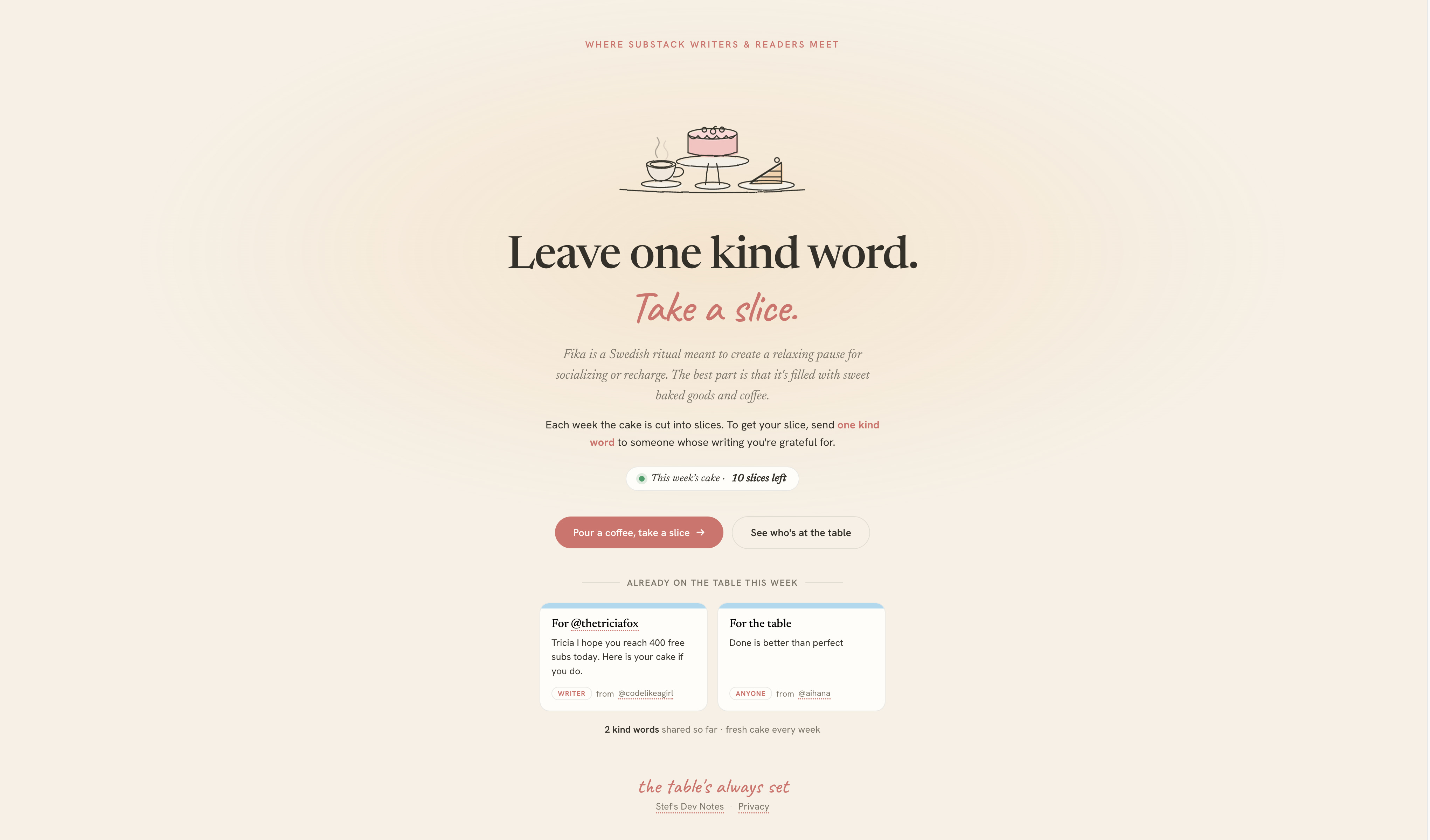
It now shows a live count of how many slices are left this week, and a new “Already on the table this week” section with the last three slices given — so the page shows activity instead of just explaining the idea. The copy got a pass too. (Thanks to Alexandru Dragoi for helping me with this.)
The one line that mattered most
Before launch, I ran myself through a UX audit — the kind where you write down every issue like it’s someone else’s app, so you can’t talk yourself out of the uncomfortable ones.
One finding: the give modal’s “who is this for” field defaulted to “anyone,” the vaguest option on the list. Someone filling out the form on autopilot, without touching that field, would publish an appreciation addressed to no one in particular. The options were already listed writer-first, anyone-last. The default just hadn’t caught up to the layout.
That one didn’t make the pre-launch cut. It sat in the backlog for five weeks until I finally changed the default from anyone to writer.
It’s the smallest change in this update, but I believe it’s the one that will matter the most (or at least I hope). It’s the only change that touches what the note-taking actually means, not just how it looks or how many clicks it takes.
What I said no to, on purpose
Two things came up more than once, and I turned both down for the same reason.
Multiple share-card designs — a bolder one, a minimal one, pick your style.
Rich text in the message field — bold, italics, quotes.
Both are real features and both got the same answer: I don’t yet know that people are sharing the card enough to justify variety, or that plain text is holding anyone back from writing what they mean. Rich text would also mean sanitizing the same message three different ways — on the wall card, in the read modal, and again in whatever gets flattened into the share-card PNG — for a need nobody’s confirmed yet.
Adding options to a funnel before you know the funnel works is design aimed at a guess.
What’s still missing
Two things from that same pre-launch audit are exactly as they were on launch day. They’re the two that could matter most, but they’re also the ones that need more judgment and technical decisions before shipping them.
There’s still no way for someone to know a slice was left for them. If you pass one to a friend, they’ll only see it if they happen to scroll the wall and recognize their own name or you share the appreciation back through Substack Notes and tag them along. Part of why: there’s no auth, no session, nothing behind “your name” but a text field, which means there’s no place to attach a notification even if I wanted to send one. The loop — someone gives, someone receives, someone comes back — is still open on the receiving end.
And the wall itself, the actual record of everything people have said, sits below the cake illustration on the page. The cake is the first impression, but the wall is the point. Right now the layout says otherwise.
This round made giving and sharing a slice smoother; receiving one, or coming back for the next round, isn’t any easier yet.
That’s something I think about next.
What building this alone actually took
None of this shows up in a list of shipped features, so here’s the part underneath it.
A fair amount of it was never code. Every change in this update started as a written spec —
what it does, what it doesn't, who it's for
— and most sat in a backlog for a while before they earned a place in a sprint that has exactly one person on it. Feedback got weighed the same way: written down, dated, and decided on, not just reacted to in the moment.
Getting the application’s preview, when sharing the link on social media or other platforms, right took a few tries. Firstly I forgot about it, then I had the image filename wrong, then wrong in a different way, before it finally matched the file I’d actually uploaded. Not a complicated bug. Just a small issue I couldn’t see was wrong until it was live and I got to share the link on social media.
I set up a full local copy of the database shortly after launching the MVP — migrations, seed data, all of it — so I’d have somewhere to break things that wasn’t the live one. Until then, any manual testing meant testing against the same database real users were already submitting to.
Deployment work was mostly the unglamorous kind: keeping the README accurate so my own setup still made sense weeks later, adding Speed Insights so “does this feel fast” had a number attached to it instead of a guess, adding light analytics tracking to understand if there is reach and engagement or not.
Some of the iteration is invisible unless you go looking for it. The welcome page copy went through two iterations on the same afternoon — one on layout, one on the actual wording — because getting the structure right and getting the words right turned out to be separate problems.
The two security fixes mentioned earlier were the same mistake in different clothes: trusting something I hadn’t checked properly.
And the profile lookup in the give modal has more edge cases than it looks like it should from the outside: someone pastes a publication URL instead of a handle, a name search comes back with two people who share it, a request times out mid-keystroke. I keep a written checklist for it. Most of the boxes are still unchecked, not because they failed, but because I haven’t hit them yet.
The app doesn’t generate its own momentum; writing about it does. That’s what this post is.
Thanks to Karo (Product with Attitude) for including Fika for Substack in her AI Builder Community Showcase along other interesting projects. Make sure you check them out!

Tell me what you’re seeing
If you’ve used the table since launch — did any of this land? Did the share card get you to actually post it, or is it sitting in your downloads folder? Would knowing someone left you a slice change whether you come back next week?
Leave a comment, reply to this email, or DM me on Substack. I’m watching the wall the same way I was five weeks ago — the question hasn’t changed, I’m just starting to have better data to look at now.
Until next time,
Stefania
Substack profiles appearing in the screenshots taken from Fika for Substack: Andrea Radojicic, Code Like A Girl, Tricia 🦊
📖 Explore more Stef’s Dev Notes reads
Articles from the ♻️ Knowledge seeks community 🫶 collection:
https://stefsdevnotes.substack.com/t/knowledgeseekscommunity
Articles from the ✨ Dev Shorts collection:
https://stefsdevnotes.substack.com/t/frontendshorts
Articles from 🚀 The Future of API Design series:
https://stefsdevnotes.substack.com/t/futureofapidesign
🗣️ If this article resonated with you
If this article resonated with you, consider recommending Stef’s Dev Notes to someone who might enjoy it.
This newsletter grows mostly through thoughtful readers sharing it with others in the industry and I really appreciate every recommendation.